Dopey, the Folder-Selection Annoyance
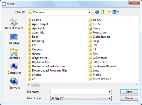
Just about every Windows program prompts a user to select a file for some purpose, such as through the Open File dialog window:
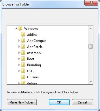
I’ll call this kind of window “Opie” for the rest of this article. Â Occasionally, a program will prompt a user not for a file, but for a folder. Â In such cases programs will typically bring up the Folder Selection dialog window, which I’ll call “Dopey“:
Had I never known Opie, I might not dislike Dopey. Â Since I do, however, I find Dopey to be a vastly inferior and annoying UI element, for several reasons:
1. Dopey can’t get to a folder directly.  Most of my files are nested four or five levels down from My Documents.  When I’m working on a project, I’ll typically have one or more of these level-4 folders open in Windows Explorer.  When I need to open one of these folders’ files from a Windows program [1], I’ll typically copy the folder path from Windows Explorer,  paste it into Opie’s “File Name” field, and press Enter.  Voilà , I’m now looking at the folder I want, and can select the file I need.  Dopey doesn’t let me cut and paste a path like this.  (Some programs complement Dopey with a field where a path can be typed or pasted, which helps a bit.  Most programs, however, leave you alone with the klutz.)
2. Dopey can leave me disoriented. Â Dopey provides very little context to let me get my bearings inside the file system. Â I often find myself looking at a list of neighboring subfolders, without any idea of who their parent is:
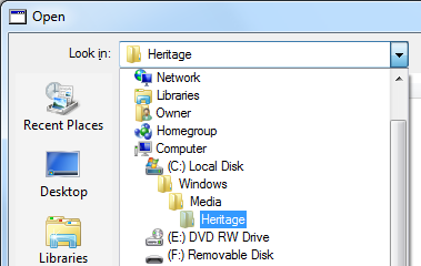
If I want to determine a folder’s parent, I’ll have to scroll a bit, and scroll quite a bit further if I need to determine its complete ancestry. Â Once I determine the full path, I’ll have to scroll back to my original location (if I can find it). Â Opie, on the other hand, lets me determine the full path (without getting lost in the process) by clicking on a drop-down arrow: [2]
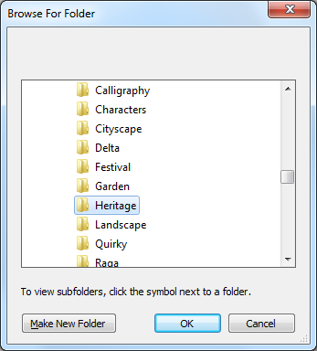
3. Dopey makes me stumble my way down into the file system.  Navigating the file system with Dopey is cumbersome.  I start out with a little window displaying just a few folders.  I have to switch between clicking, scrolling vertically, and scrolling horizontally as I dig down into the file system.  With Opie, on the other hand, I can often get where I want  just by double clicking, often without any scrolling.  [3]
I’ve run into a few programs that show me Opie instead of Dopey when prompting for a folder.  I wish more Windows programs did this (hear ye, hear ye, Windows application developers!)  Ultimately, I hope (in vain?) that Dopey will be deprecated by Microsoft, banished from our UIs, and sent to join Clippy in exile.
 Notes:
[1] Yes, most files can be opened by double-clicking them in Windows Explorer. Â However, I still find myself using File -> Open pretty frequently. Â Somehow it’s more convenient than Explorer at times.
[2] For some programs in Windows 7, you don’t even a need to click a drop-down, since Opie looks just like Windows Explorer, and includes an address bar.
[3] This is due to the fact that Opie displays only a single level of subfolders at a time, and can display them in a multi-column list, which reduces the need to scroll or enlarge the dialog window.


